
Most contouring advice is still stuck in the era of visible stripes, oversized triangles, and the idea that every face needs the same map. That approach doesn't belong in a premium spa, a Swiss pharmacy, or a clean beauty retail environment. It makes contouring look complicated, heavy, and easy to get wrong.
Professional contouring make up should do the opposite. It should read as believable structure, healthy balance, and refined light control. In a natural cosmetics setting, the goal isn't to remake the face. It's to place soft depth exactly where it improves harmony, then blend until the work disappears.
That shift matters commercially as much as artistically. Clients who reject theatrical sculpting will still say yes to a product or service that gives them a fresher cheekbone, a cleaner jawline, or a more rested-looking eye area without looking “done”. That is the version of contouring worth demonstrating and worth stocking.
Redefining Contouring for Modern Natural Beauty
Contouring isn't a novelty technique created for social media. Its roots go back to the Elizabethan era, it was later modernised by drag performers, and it eventually became a mass-market beauty practice. The reason it remains relevant is simple. The category became easier to wear once cream-based and stick formats were developed for different skin tones and textures, as noted in L'Officiel's history of contouring.
Why the old contouring model fails in premium settings
Heavy contouring photographs as makeup first and skin second. In person, it often looks dry at the edge, muddy through the cheek, and disconnected from the client's natural undertone. That may work for stage, drag, or a highly stylised editorial brief. It rarely works for a spa facial suite, a pharmacy beauty bar, or a customer who wants polish she can repeat at home.
Clean beauty changes the standard. The finish has to stay close to skin. Product choice has to support comfort and blendability. The result has to flatter in daylight, not only under ring lights.
Practical rule: If the contour is the first thing you notice, it's too strong for a natural-finish service.
What modern contouring make up is really doing
At its best, contouring make up creates quiet structure. It restores dimension that base products can flatten. It balances proportions. It guides the eye. A small amount placed correctly can make the centre of the face look brighter, the cheek look more lifted, and the perimeter look more refined.
That's why the technique belongs in a premium natural assortment. It complements skin tints, luminous foundations, balm textures, and complexion products marketed around radiance rather than coverage. It also suits the language that discerning clients respond to. “Enhance” sells better than “transform”. “Lift” lands better than “carve”.
A useful way to frame contouring in-store is to compare it with tailoring. The garment doesn't change. The fit improves. That's how a well-chosen contour shade should behave on skin.
The clean beauty lens
In practice, clean contouring asks three questions before any product touches the face:
- Does the texture fuse with skin rather than sit on top of it?
- Does the shade mimic a shadow rather than read as bronzer or blush?
- Can the client repeat it easily with minimal product and simple tools?
If the answer to any of those is no, the result usually becomes either theatrical or frustrating.
For professionals, that's the opening to re-educate the client. Contouring isn't about drawing more lines. It's about placing fewer lines with more intent.
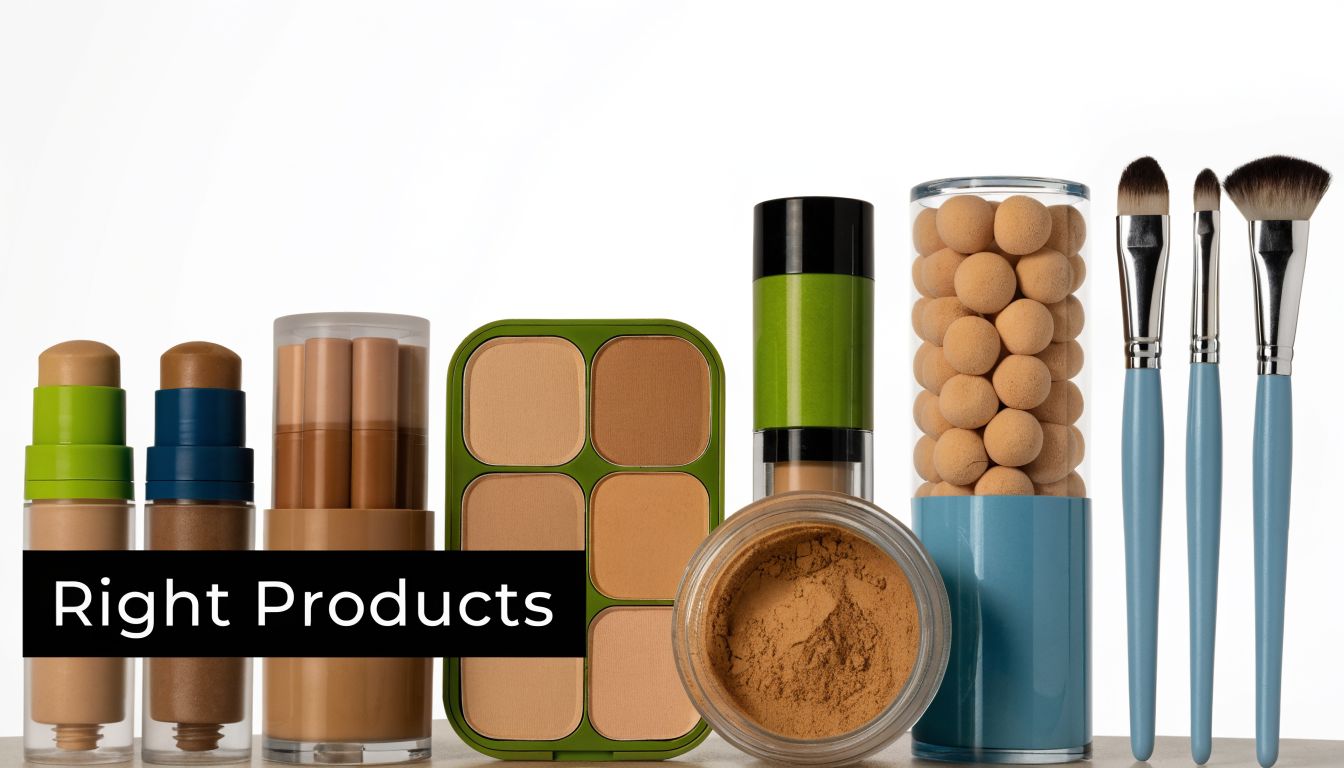
Selecting the Right Products for a Clean Contour
Product choice decides whether contour reads polished or obvious. In a clean beauty setting, that usually means starting with creams and liquids, then using powder only where skin behaviour calls for it. The finish matters as much as the shade. Clients who invest in natural complexion products rarely want a dry stripe sitting on top of luminous skin.
In treatment rooms and on retail counters, I look for formulas that stay movable for long enough to adjust placement, then settle without turning greasy. That balance is harder to get right than marketing suggests. Very waxy sticks can drag over SPF or skin tint. Very fluid liquids can disappear too fast on richer skincare, especially if the client uses facial oil underneath.
Why creams outperform powders for skin-first results
Cream textures usually give the most believable depth because they merge with moisturised skin instead of sitting as a separate layer. They also handle real-world skin better. Fine dehydration lines, post-treatment dryness, and mature texture tend to look softer under cream than under powder.
Powder still earns its place.
It works well for selective reinforcement, for oily zones, and for clients who want more hold under bright lighting or long retail days. Used alone, though, powder contour often looks flat at close range. Used over a thin cream base, it becomes much more convincing.
Here is the practical trade-off:
| Format | Best use | Watch out for |
|---|---|---|
| Cream stick | Fast placement, precise control, useful for cheek, temple, and jaw mapping | Direct application can overload one area and disturb base underneath |
| Liquid wand | Soft diffusion, accessible for live demonstrations, easy for clients to copy at home | First contact can release too much product, so dispense onto the hand or brush first |
| Cream balm in pot | Flexible finish for dry, mature, or sensitised skin, easy to customise with a brush | Slower in high-volume service settings and less hygienic without strict spatula use |
| Powder contour | Setting, refining, and touch-ups on combination or oily skin | Can catch on texture and read chalky if the base is dewy or skin is dehydrated |
For spa professionals, hygiene and speed matter alongside finish. Sticks and wands sell quickly because clients understand them at a glance, but pots often perform better in cabin services where you can control dosage with a spatula and brush.
Shade selection matters more than branding
Poor contour usually starts with the wrong undertone. A shade that runs too golden behaves like bronzer. A shade that is too deep creates a patch before you have time to blend it out. A cool grey-brown can be excellent on one client and lifeless on another.
Use a simple filter when buying and demonstrating:
- Choose a shade that suggests shadow. It should deepen the skin naturally without adding obvious warmth.
- Test it on the outer cheek or jaw. Hands distort both depth and undertone.
- Check it over the client's actual base. SPF, primer, and skin tint can shift how the contour sits and how deep it appears.
- Match texture to texture. A fresh, radiant base calls for a cream or balm contour with similar slip.
Retail conversations often start with a product the client has seen online. The better sale comes from translating that reference into the right texture, undertone, and price point for the person in front of you. If someone wants the soft cushion and easy blend of a popular wand without beginning at the luxury tier, this guide to affordable Makeup Revolution contour wand dupes helps frame the discussion around applicator style and finish.
Build assortments by skin behaviour
A single contour SKU rarely performs well across a premium natural assortment. Buyers and trainers get better results by ranging products according to how skin behaves during the day.
- Dry or mature skin: prioritise emollient creams and balms that stay flexible and do not grip to texture.
- Combination skin: stock a cream contour that can be set lightly through the centre of the face.
- Oily skin: keep a cream option for realistic depth, plus a compatible powder for targeted setting.
- Minimalist clients: offer a neutral cream stick that can shape the face and add soft definition through the eye socket.
- Post-facial or sensitised skin: avoid heavily fragranced formulas and choose textures that blend with minimal rubbing.
The best contour product disappears into the complexion, works over skincare and SPF, and lets the client recognise themselves immediately. In premium clean beauty, that is what sells.
Analysing Face Geometry for Precision Application
Good contouring starts before application. The face has to be read structurally. Not every client needs more cheekbone. Some need a softer temple, a shorter forehead, a cleaner side profile, or better balance between the upper and lower face. Once you see contour as geometry, placement becomes far more precise.
Charlotte Tilbury's face-shape guidance treats contour that way, recommending, for example, temples and forehead placement on oval faces to shorten the face slightly, while also emphasising contour on low planes such as the jawline and sides of the nose. The same guidance highlights underpainting, where sheer foundation is applied over contour for a smoothly blended, lifted finish in polished professional settings, as explained in this face-shape contouring guide.
Diagnose before you draw
A quick professional assessment usually comes down to three checks:
Length versus width
Is the face reading long, balanced, or broad?Where is the visual weight
Forehead, cheeks, jaw, or chin?Which feature should advance or recede
Not every area needs contour. Often one or two placements are enough.
This keeps the service customized. It also prevents the common mistake of copying a social media map onto a face that needs a different correction.
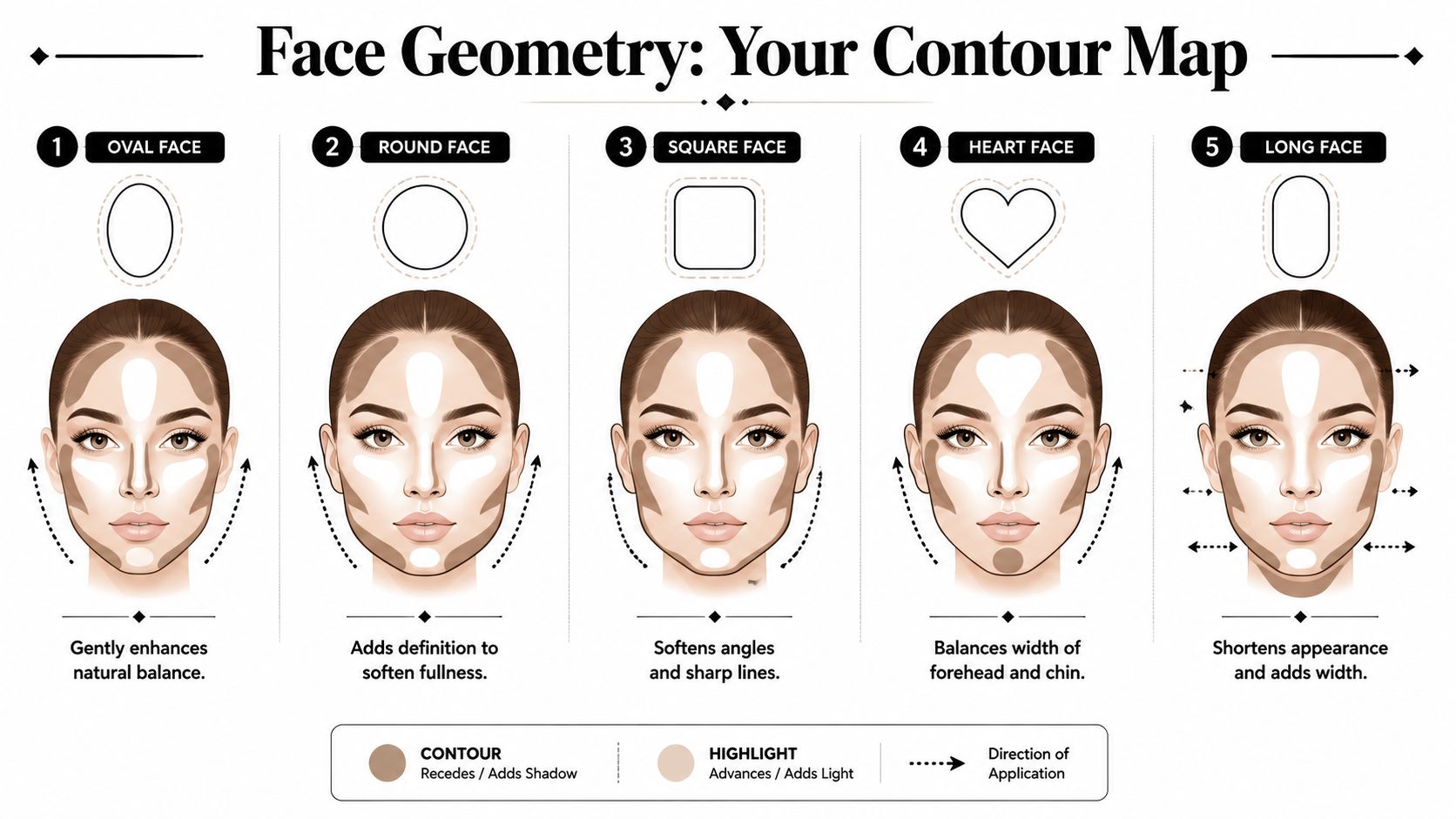
Placement by shape
The broad principles are straightforward:
Oval face
Usually needs restraint. A touch at the temples, forehead edge, and a slightly deeper cheek placement can add definition without disturbing balance.Round face
Place contour a little higher and slightly more vertical through the outer cheek to reduce visual width and encourage lift.Square face
Diffuse softly at the temples and jaw corners. The goal isn't to hide bone structure. It's to soften the abruptness of the angles.Heart face
Balance the upper face with controlled contour near the temples, then keep the lower face lighter and cleaner unless the chin needs visual shortening.Long face
Work horizontally. Forehead and lower chin contour can shorten the face, while cheek placement should widen rather than drag downward.
Strong contour on the wrong part of the face doesn't sculpt. It distorts proportion.
Light changes everything
A contour that looks elegant in a treatment room may look overworked near a window. For that reason, intensity has to match the environment. Daylight wants diffusion. Evening and photography can take slightly more structure, but only if the transitions are smooth.
A practical method in premium settings is to check the client in at least two mirrors or angles before finishing. If the contour is obvious only when the head is still and front-facing, it likely needs more blending.
Underpainting for subtle refinement
Underpainting is one of the most useful advanced methods for clean beauty professionals. Place contour first, keep it sheer, then veil foundation or skin tint over the top. This softens the makeup signature and leaves behind shape rather than visible product.
It works especially well for clients who dislike “makeup makeup” but still want improvement on camera or in person. It also makes demonstrations feel more refined because the skin remains the focus throughout.
Mastering Application for Natural and Defined Looks
Technique decides whether contouring make up looks elevated or obvious. The professional sequence is layered: prep hydrated skin, apply foundation, establish highlights, build shadows, blend, then set with translucent powder. The classic number 3 mapping, from hairline to under the cheekbone and down towards the jawline, remains a reliable guide, and artist education also warns that the biggest mistake is applying too much product at the start, as outlined in this contouring tutorial from Ogle School.
The base has to be ready for cream products
Contouring fails quickly on dehydrated or tacky skin. Hydrated doesn't mean greasy. It means the skincare has settled, the base isn't slipping, and there's enough flexibility in the complexion for cream pigment to move cleanly.
A reliable prep sequence looks like this:
- Hydrate first with moisturiser appropriate to the skin type.
- Let sunscreen or primer settle before moving in with complexion products.
- Apply foundation thinly so contour has room to show through.
- Place highlight intentionally before shadow, especially under the eyes and at the centre of the face.
The natural look
For daywear, the objective is soft lift. Use a small amount of cream contour on the outer forehead, under the cheekbone, and lightly at the jaw only if the jaw needs clarity. Then blend upward and outward. Don't drag pigment toward the mouth.
Use tools according to the finish you want:
- Dense synthetic brush gives the most control and works well for cheeks and jaw.
- Damp sponge softens edges fast and helps merge contour into foundation.
- Fingertips work best for small areas or balm textures, especially around the nose.
The natural version should be almost impossible to identify as contour. The cheek looks slightly raised. The face looks more dimensional. That's enough.
Artist check: Pause after the first blend. Most faces need less product than the initial plan suggests.
The defined look
For photography, events, or stronger evening makeup, the structure can go deeper, but the logic doesn't change. Build in thin passes. Let each layer settle before adding another. Keep the centre of the face clearer so the contour has contrast without becoming muddy.
The difference isn't just more product. It's more intentional placement. A defined look might include:
- a clearer temple contour,
- a stronger cheek placement with a tighter blend,
- added side-nose shaping,
- and selective setting for longevity.
Clients preparing for flash photography often ask why their contour disappears on camera. Usually the issue isn't lack of product. It's lack of contrast between the perimeter and centre of the face. For teams advising on event makeup, these AI tips for perfect photo makeup can help frame the conversation around how makeup reads differently in photographs.
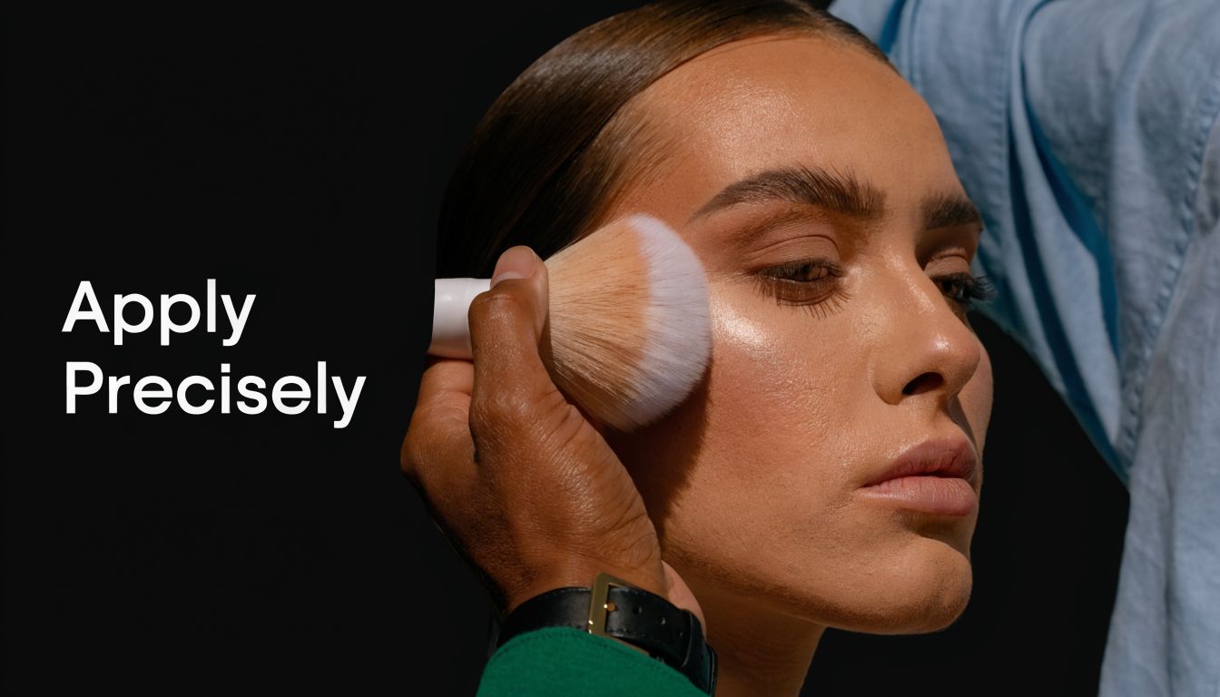
A visual demonstration helps clients understand the pressure and blending speed required:
Blending methods that work
The most refined blend usually happens in stages, not all at once.
- Place the contour where you want depth most concentrated.
- Tap the edge first, not the centre. This keeps the deepest point where it belongs.
- Blend upward on the cheek and outward at the forehead.
- Return with foundation brush or sponge to soften transitions without erasing shape.
- Set only where needed with translucent powder.
A few common errors are worth naming directly:
| Problem | What caused it | Better approach |
|---|---|---|
| Harsh stripe | Too much product from the start | Load the brush from the hand, not directly from the stick |
| Muddy cheek | Placement too low or blended inward | Keep contour above the hollow and diffuse upward |
| Patchy jawline | Dry base or too much friction | Pat product in with a brush, then refine lightly |
| Flat result | No highlight contrast | Brighten centre zones before adding more shadow |
The best contouring make up doesn't announce itself. It reorganises light so the face looks awake, polished, and balanced.
Troubleshooting and Advanced Customisation
Most contour issues aren't dramatic. They're subtle failures of texture, tone, or timing. The contour pills over sunscreen. The cheek goes muddy by midday. The shade looked right in-store but turns orange on the face. These are the problems professionals need to solve.
One major gap in Swiss-facing education is layering contour over mineral SPF. Daily SPF use among adults aged 25 to 55 in Switzerland has increased by over 40% since 2021, yet tutorials rarely explain how to apply contour over zinc oxide-rich formulas without pilling or patchiness, creating a clear advisory opportunity for pharmacies and clinics, according to this discussion of contouring techniques and SPF layering.

Fixing the three most common failures
Start with diagnosis, not more product.
Patchiness
Usually comes from friction, unsettled skincare, or applying cream over a base that has already set too firmly. Press and bounce. Don't scrub.Muddiness
This is often placement, not colour alone. If the contour sits too low on the cheek or too close to blush, the face loses lift.Wrong undertone
Orange reads like bronzer. Flat grey can look lifeless. Adjust by mixing with complexion product or switching to a more neutral depth.
If the contour looks wrong before blending, blending won't rescue it. Remove part of it and reset.
Working over high-SPF mineral formulas
Mineral SPF changes the surface feel of skin. Zinc oxide-rich textures can grip, resist slip, or ball up when layered incorrectly. The answer isn't to abandon cream contour. It's to slow the sequence down.
Use this method in treatment rooms and retail demos:
- Allow SPF to settle fully before any complexion product.
- Apply base in a thin veil, not a heavy full layer.
- Warm cream contour on the back of the hand rather than drawing directly from the stick.
- Press on with a brush in small amounts.
- Refine with a damp sponge only after the contour has anchored.
This approach reduces pilling because the skin isn't being rubbed repeatedly. It also keeps the sunscreen layer more intact than aggressive buffing.
Mature skin and textured skin need a lift strategy
On mature skin, contour should lift rather than hollow. Keep placement slightly higher, avoid dragging shadow too far inward, and choose flexible creams that don't set into a dry ridge. Skip overloading the jaw and nasolabial zone. Those areas can become heavier, not firmer.
On textured skin, the finish matters as much as the map. Matte is fine, but dry-matte often exaggerates unevenness. A skin-like cream with controlled setting usually looks more refined than a flat powder contour.
Adapting depth across skin tones
There is no universal contour colour. The right choice depends on both depth and undertone. The principle stays consistent, though. A contour should resemble a plausible shadow on that skin tone.
For professional teams, a simple fitting routine helps:
| Skin presentation | Better contour direction |
|---|---|
| Very fair | Soft neutral or cool depth, used sparingly |
| Light to medium | Neutral-to-cool cream with moderate depth |
| Tan to deep | Richer contour tones that create depth without turning ashy |
| Olive undertones | Avoid overly red or orange contours that interrupt the skin's natural balance |
The more diverse the client base, the more important tester hygiene, cheek-side shade comparison, and trained language become. “Let's find your shadow tone” works better than “this is the dark one”.
Merchandising and Training for Business Growth
The strongest contour business in a premium natural setting is built on restraint. Clients rarely need a dramatic sculpting lesson. They need a fast, believable complexion service they can repeat at home, and retail teams need a clear way to demonstrate it without slipping into corrective language or overcomplicated artistry.
For spas, pharmacies, and selective retailers, contour sells best when it is merchandised as part of a polished complexion wardrobe. Place it near skin tints, concealers, cream blush, SPF-friendly primers, brushes, and light setting products so clients see a complete routine. That pairing matters in clean beauty, where finish, skin feel, and product compatibility often drive the sale more than trend language.
How to merchandise it so clients understand it
A good display reduces decision fatigue. Keep the edit tight and effect-led.
- Build a contour edit with one cream contour, one brightening or highlighting product, and one blending tool.
- Merchandise by client outcome such as everyday definition, event polish, or mature-skin refinement.
- Use tester language that describes the result with terms like lift, soften, define, and balance.
- Show texture before shade by letting clients feel the cream and see how it blends over prepared skin.
In-store, demonstration converts better than explanation alone. A two-minute cheek demo usually does more than a full face application because the client can compare one side against the other without feeling overworked. For retail staff, that also keeps throughput realistic during busy trading hours.
Train teams to sell enhancement, not correction
Training should give staff a repeatable service pattern and better language. “This adds gentle structure after complexion products” is more useful than “this fixes roundness” or “this slims the face.” The first approach protects the premium experience and makes the technique feel accessible to clients who want polish, not transformation.
I train teams to anchor every recommendation to three points. Placement, texture, and finish. If the product sits well over skincare and SPF, blends quickly, and looks credible in daylight, staff can sell it with confidence.
For e-commerce partners and retail marketers building content-led sales support, HiveHQ's guide to beauty affiliate marketing is a useful reference for thinking about how education, product pairing, and creator-style recommendations can extend category visibility beyond the shelf.
Service ideas that increase basket size
Attach contour to practical services clients already understand.
- Mini complexion consultation at the counter
- Photo-ready finish add-on for event makeup bookings
- SPF-plus-complexion demonstration in pharmacies and clinics
- Take-home contour kit after a treatment or makeover
The commercial advantage is straightforward. Cream contour performs well in a natural beauty environment because it supports cross-selling. One successful demo can lead to a brush, complexion base, brightener, setting product, and a follow-up skincare recommendation.
For Swiss retailers, pharmacies, spas, and e-commerce partners looking to build a credible clean beauty assortment, beautysecrets.agency offers curated natural and ethically sourced cosmetics and skincare with the standards, brand storytelling, and trade support needed to turn techniques like contouring make up into confident retail and service experiences.


